
Applying statistical process control (SPC) to industrial processes fails when engineers select control chart architectures mismatched to the underlying data distribution. Applying an \(I\text{-}MR\) chart to rational subgroups or a \(p\)-chart to count data with non-constant sample sizes distorts control limits, triggering frequent false alarms or masking operational shifts.
Control charts separate common-cause variation (inherent system noise) from special-cause variation (assignable process disruptions). Establishing an effective SPC monitoring regime requires matching data stream topology, subgroup size \(n\), and sample structure to the chart type mathematically derived to evaluate those properties.
Figure 1: Decision tree for control chart selection
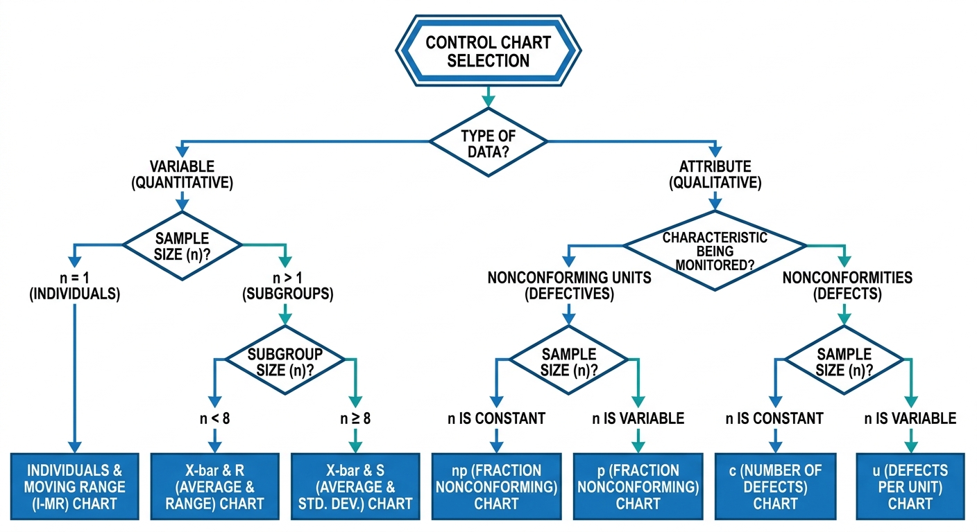
Classifying Process Data: Continuous vs. Discrete Topology
The baseline decision point in chart selection is whether the process variable is continuous (variable) or discrete (attribute).
Continuous data represent physical, dimensional, or chemical parameters measured on an interval or ratio scale—such as shaft diameters (\(\text{mm}\)), bearing temperatures (\(^\circ\text{C}\)), or vibration velocity (\(\text{mm/s}\)). Continuous parameters contain high information density, enabling early detection of subtle mean shifts or variance changes with small sample sizes.
Discrete data represent qualitative outcomes or countable events, split into two classifications:
- Conformities (Defectives): Binary metrics measuring whole units as pass or fail (e.g., an engine block is either conforming or cracked).
- Nonconformities (Defects): Specific defect counts on a defined unit or area (e.g., four surface scratches on a single panel).
Selecting the wrong topology violates core probability assumptions (such as applying Gaussian normal approximations to discrete Poisson events), rendering control limits mathematically invalid.
| Data Type | Property Monitored | Subgroup Size (\(n\)) | Primary Chart Type | Secondary/Dispersion Chart |
|---|---|---|---|---|
| Variable (Continuous) | Individual Value | \(n = 1\) | \(I\) (Individuals) | \(MR\) (Moving Range) |
| Variable (Continuous) | Mean & Dispersion | \(2 \le n \le 10\) | \(\bar{X}\) (Sample Average) | \(R\) (Range) |
| Variable (Continuous) | Mean & Dispersion | \(n > 10\) | \(\bar{X}\) (Sample Average) | \(s\) (Standard Deviation) |
| Attribute (Discrete) | Fraction Defective | Variable or Fixed | \(p\) (Proportion) | N/A |
| Attribute (Discrete) | Number Defective | Fixed | \(np\) (Count Defective) | N/A |
| Attribute (Discrete) | Defects Per Unit | Variable | \(u\) (Defects per Unit) | N/A |
| Attribute (Discrete) | Total Defects | Fixed | \(c\) (Defects per Subgroup) | N/A |
Selection Logic for Variable Process Monitoring
For continuous measurements, chart selection depends entirely on the rational subgroup size \(n\). Rational subgrouping minimizes within-subgroup variation (attributable solely to common cause noise) while maximizing between-subgroup variation (reflecting process shifts).
When measurements are gathered individually (\(n = 1\)) due to low production volume, destructive testing, or long processing cycle times, use the Individuals and Moving Range (\(I\text{-}MR\)) chart. Central tendency is tracked via individual values (\(I\)), while dispersion is estimated using the moving range (\(MR\)) between consecutive points:
$$MR_i = |X_i - X_{i-1}|$$
Caution: For automated, high-frequency sensor feeds exhibiting autocorrelation, \(I\text{-}MR\) charts artificially compress control limits, increasing false alarm rates.
When rational subgroups (\(n \ge 2\)) are available, pair the sample mean chart (\(\bar{X}\)) with a dispersion chart:
- \(\bar{X}\) and \(R\) Charts (\(2 \le n \le 10\)): The sample range (\(R = X_{\max} - X_{\min}\)) provides an efficient estimator of population dispersion for small subgroups without heavy statistical computation.
- \(\bar{X}\) and \(s\) Charts (\(n > 10\)): As subgroup size exceeds \(n = 10\), the range estimator loses statistical efficiency and becomes sensitive to single extreme values. The sample standard deviation (\(s\)) provides a mathematically superior, unbiased estimate of process dispersion.
Figure 2: Distribution shifts in continuous variable charts
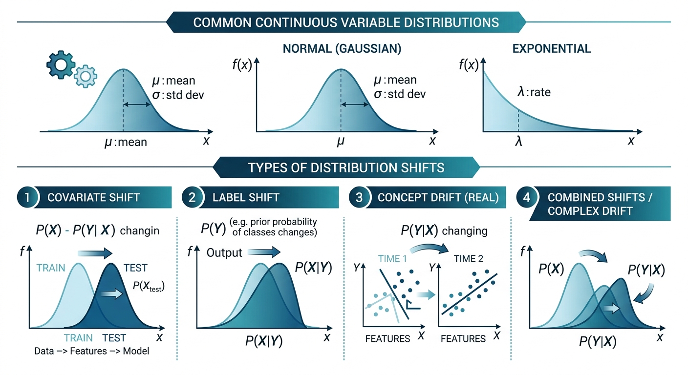
Once limits are established using our Control Chart Tool, compute process capability indices (\(C_{pk}\), \(P_{pk}\)) with the Process Capability Calculator to quantify tolerance compliance.
Selecting Attribute Charts for Discrete Quality Metrics
Attribute control charts model discrete events using Binomial or Poisson probability distributions. Applying standard continuous normal equations to discrete parameters introduces severe boundary errors near zero-defect regimes.
Binomial-Based Charts: \(p\) and \(np\)
Binomial charts evaluate unit-level compliance where each inspected item represents an independent Bernoulli trial with fixed probability \(p\).
- \(p\)-Chart (Proportion Nonconforming): Tracks the ratio of defective units \(p = x / n\). It handles variable subgroup sizes (\(n_i\)) by recalculating upper and lower control limits for each sample interval.
- \(np\)-Chart (Number Nonconforming): Tracks the absolute count of defective units (\(np\)). Subgroup size \(n\) must remain strictly constant to maintain fixed limit boundaries across operator visual displays.
Poisson-Based Charts: \(c\) and \(u\)
Poisson charts model the occurrence rate of individual nonconformities across continuous inspection areas, volumes, or time intervals.
- \(c\)-Chart (Count of Defects): Tracks total defect counts (\(c\)) across a constant, fixed unit of inspection (e.g., total voids per 100 meters of insulated wire).
- \(u\)-Chart (Defects per Unit): Tracks the average defect rate per unit (\(u = x / n\)) when inspection sample size or area varies between subgroups.
When root-cause analyses reveal specific failure modes during a failure mode and effects analysis using the FMEA Tool, tracking those specific metrics on attribute charts validates mitigation efficacy. For high-yield processes where defect rates drop below 100 PPM, standard attribute charts suffer from zero-bound compression; measure micro-defect rates using the DPMO Calculator or apply time-between-events \(g\)-charts and \(t\)-charts.
Step-by-Step Worked Calculation Example: \(\bar{X}-R\) Chart
Consider a CNC machining operation turning steel shafts. The critical quality characteristic is outer diameter, targeted at \(25.000\text{ mm}\).
An engineer collects \(k = 5\) rational subgroups, each containing \(n = 4\) shafts measured sequentially across consecutive production shifts.
Step 1: Subgroup Measurements, Means (\(\bar{X}_i\)), and Ranges (\(R_i\))
| Subgroup (\(i\)) | \(x_1\) | \(x_2\) | \(x_3\) | \(x_4\) | Sum (\(\sum x\)) | Mean (\(\bar{X}_i\)) | Range (\(R_i\)) |
|---|---|---|---|---|---|---|---|
| 1 | 25.020 | 25.080 | 25.040 | 25.060 | 100.200 | 25.050 | 0.060 |
| 2 | 25.000 | 25.030 | 25.070 | 25.020 | 100.120 | 25.030 | 0.070 |
| 3 | 25.100 | 25.050 | 25.080 | 25.010 | 100.240 | 25.060 | 0.090 |
| 4 | 24.980 | 25.020 | 25.010 | 25.030 | 100.040 | 25.010 | 0.050 |
| 5 | 25.040 | 25.060 | 25.020 | 25.080 | 100.200 | 25.050 | 0.060 |
Step 2: Calculate Grand Mean (\(\bar{\bar{X}}\)) and Average Range (\(\bar{R}\))
Grand Mean:
$$\bar{\bar{X}} = \frac{\sum \bar{X}_i}{k} = \frac{25.050 + 25.030 + 25.060 + 25.010 + 25.050}{5} = \frac{125.200}{5} = 25.040\text{ mm}$$
Average Range:
$$\bar{R} = \frac{\sum R_i}{k} = \frac{0.060 + 0.070 + 0.090 + 0.050 + 0.060}{5} = \frac{0.330}{5} = 0.066\text{ mm}$$
Step 3: Unbiasing Constants for Subgroup Size \(n = 4\)
Standard control chart factors for \(n = 4\):
- \(A_2 = 0.729\)
- \(D_3 = 0\)
- \(D_4 = 2.282\)
- \(d_2 = 2.059\)
Step 4: Compute Mean (\(\bar{X}\)) Control Limits
$$UCL_{\bar{X}} = \bar{\bar{X}} + A_2 \bar{R} = 25.040 + (0.729 \cdot 0.066) = 25.040 + 0.0481 = 25.0881\text{ mm}$$
$$LCL_{\bar{X}} = \bar{\bar{X}} - A_2 \bar{R} = 25.040 - (0.729 \cdot 0.066) = 25.040 - 0.0481 = 24.9919\text{ mm}$$
Step 5: Compute Dispersion (\(R\)) Control Limits
$$UCL_R = D_4 \bar{R} = 2.282 \cdot 0.066 = 0.1506\text{ mm}$$
$$LCL_R = D_3 \bar{R} = 0 \cdot 0.066 = 0.0000\text{ mm}$$
Figure 3: Completed X-bar and Range control chart plot
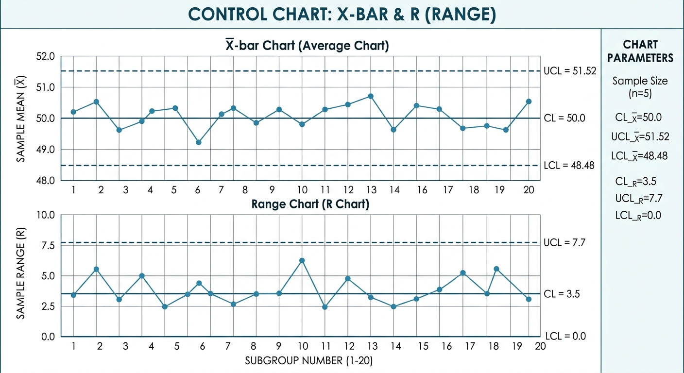
Step 6: Process Standard Deviation Estimate and Stability Evaluation
Estimate process standard deviation (\(\hat{\sigma}\)):
$$\hat{\sigma} = \frac{\bar{R}}{d_2} = \frac{0.066}{2.059} = 0.03205\text{ mm}$$
Evaluating subgroup values against control limits:
- All sample means (\(\bar{X}_i\)) lie bounded between \(LCL_{\bar{X}} = 24.9919\text{ mm}\) and \(UCL_{\bar{X}} = 25.0881\text{ mm}\).
- All sample ranges (\(R_i\)) lie below \(UCL_R = 0.1506\text{ mm}\).
The machining process demonstrates statistical control with zero detectable special-cause signals.
Conclusion
Correct control chart selection requires matching process data topology and subgrouping logic to the correct underlying probability distribution. Continuous variables demand \(\bar{X}\text{-}R\) or \(\bar{X}\text{-}s\) charts for subgrouped data and \(I\text{-}MR\) charts for single-point streams. Discrete attributes require Binomial (\(p\), \(np\)) or Poisson (\(c\), \(u\)) architectures depending on unit categorization and sample stability. To automate limit generation, execute process capability analyses, and access specialized engineering calculators, visit ReliabilityCalc.com.